

Colour usually arrives late in a photograph’s meaning. We register the subject first, then the mood, and only afterwards notice that the red in the corner has been steering us all along. Vibrant Fusion of Worlds reverses that order. Colour comes first, and the subject, if there is one, has to fight its way out of it.
Colour as Architecture
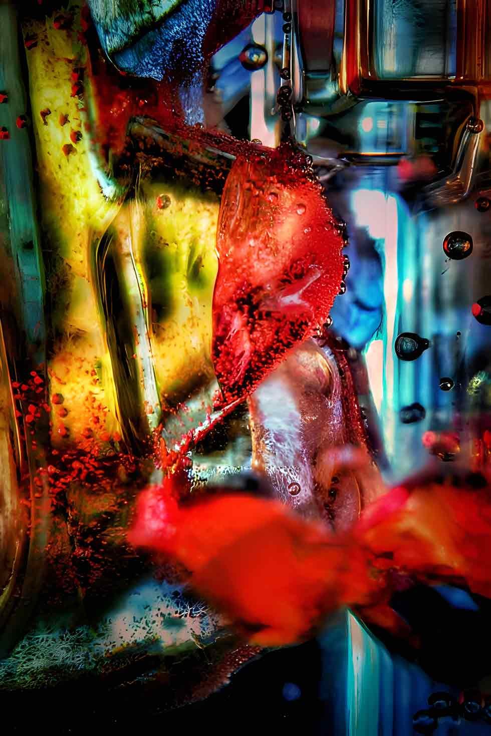
The picture is tall and dense. Near its centre, a mass of fiery red and orange twists through the frame in organic, branching shapes, and the official description suggests flames or perhaps blood vessels pulsing with life. Around and behind it, cooler blues and teal greens run in vertical bands, a little like scaffolding, while yellow glows in the gaps. Small circular forms, some reading as bubbles or droplets, punctuate the surface.
What matters is how these colours behave structurally. Warm hues advance and cool hues recede, so the red seems to sit in front of the picture and the blues behind it, creating depth without any perspective drawing. The vertical blues and greens give the image a skeleton, a sense of rooms or corridors, that the red then invades. The composition is built from temperature differences rather than from lines or objects.
Colour contrast also keeps the image from collapsing into noise. Complementary pairs, red against green, orange against blue, vibrate where they meet, and the picture is full of such borders. Each one produces a small flicker at the edge, which is partly why the surface seems to hum. A photograph this saturated is always at risk of overwhelming the eye, and the cooler passages act as rests, brief pauses that make the next burst of red feel brighter.
This is a specific kind of abstraction. Instead of simplifying a scene, the photograph accumulates. It layers colour upon colour until the surface becomes a field of competing claims, and the viewer is left to decide which one to believe.
A Picture Without a Centre
According to the official text, there is no clear focal point, and that is the key compositional decision. The eye cannot rest on a single dominant form. It travels, snagging on a droplet, sliding down a blue stripe, circling back to the red. Each pass seems to turn up something new.
There is a family resemblance here to the all-over canvases of mid-century abstract painting, where the surface is treated as one continuous event rather than a stage with a hero. The comparison should not be pushed too far, since this is photographic art with its own conditions, but the underlying idea is shared: when nothing is privileged, looking becomes an activity instead of a reception.
The vertical format helps. A tall frame encourages scanning from top to bottom, and the repeated stripes act like rungs, so the eye climbs, loses its place and begins again. In that sense the viewer’s path is itself part of the composition.
Surfaces That Disagree
The textures complicate matters. The description speaks of surfaces ranging from smooth and glassy to rough, and the image supports that reading. Some passages look polished, as though seen through water. Others look pitted and grainy, closer to weathered metal or old paint. Light appears to come from inside the image rather than from outside it, which reinforces the impression that these are glowing substances, not lit objects.
Whether the layering comes from optics, from processing or from both is not documented on the artist’s website, and it need not be settled here. The finished surface, at least, feels worked, assembled rather than discovered, and the title’s idea of fusion is literal: several kinds of visual material have been joined without hiding the joins.
Three Readings and No Verdict
The official description declines to choose a single meaning. It offers the inner workings of the human body, a microscopic view of life, or simply a celebration of colour and form, and the image comfortably supports all three. A red branching form can be a vessel, a cell or a petal. Droplets can be blood, water or light. The ambiguity is not a flaw to be corrected by a better caption. It is the work’s central material.
That position is worth setting beside Karel Fehr’s history. His career in commercial photography, more than forty years by his own website’s account, belongs to a field where an image generally exists to say one thing clearly. After retiring, he turned to photographic art and a looser, more conceptual way of working. Vibrant Fusion of Worlds can be read as the opposite of a commercial brief: a picture designed so that no single answer is correct.
The gallery’s broader description mentions colour that runs from saturated to translucent and is used for emotional effect as much as visual impact. Here the saturated end of that range is on show, pushed until it becomes almost unstable. It is the sort of picture that changes depending on what the viewer brings, and that, finally, is its achievement. It does not tell us what colour means. It lets colour mean several things at once, and trusts us to live with that.
More of Karel Fehr’s abstract colour work can be seen at karelfehr.com.
