

If you’ve never heard the terms “grisaille” or “glazing” before, don’t worry; you don’t need an art history degree to appreciate what contemporary painter Lib Mason is doing. You just need a willingness to look a little longer than usual, because her paintings are built to reward exactly that.
From Magazine Pages to Museum-Style Technique
Mason didn’t start out painting the way she does now. She studied editorial illustration at the Rhode Island School of Design and spent years as a working commercial illustrator, creating images for major publications like Rolling Stone and Time Life Warner. Later, her career expanded into product development, including several artist-branded licensed lines the kind of steady, client-driven work that keeps an illustrator busy but doesn’t always leave room for personal expression.
About eight years ago, Mason retired from that commercial career. What came next wasn’t a slower version of the same thing. It was something new entirely: a return to oil painting, built around a technique with roots stretching back to Flemish and Renaissance painters.
What the Flemish Technique Actually Means
Here’s the simple version. Mason starts every painting with something called a grisaille, basically a painting done entirely in gray tones, like a black-and-white photograph rendered in paint. This step isn’t decorative. It’s how she works out where the light falls, how three-dimensional forms should look, and how the whole composition will hold together before color ever gets involved.
Once that foundation is solid, she adds color in thin, see-through layers called glazes, one on top of another, over and over. Because each layer is transparent, light passes through it and bounces back off the layers underneath, which is part of why paintings made this way tend to look like they’re glowing from within rather than just sitting flat on the surface. It’s a slow process, and it’s the same basic method Flemish and Renaissance painters used centuries ago. Mason didn’t invent it; she’s borrowing it, on purpose, to paint subjects that couldn’t be further from anything those historical painters were depicting.
Serious Subjects, Wrapped in Beauty
That’s really the heart of what makes Mason’s work interesting: she takes an old, careful, beautiful technique and points it at very current, often uncomfortable subjects politics, social issues, the environment. And she doesn’t paint them literally. Instead, she uses symbolism, humor, and even absurdity to get at what she’s really trying to say, so the paintings pull you in visually before you realize what’s actually going on underneath.
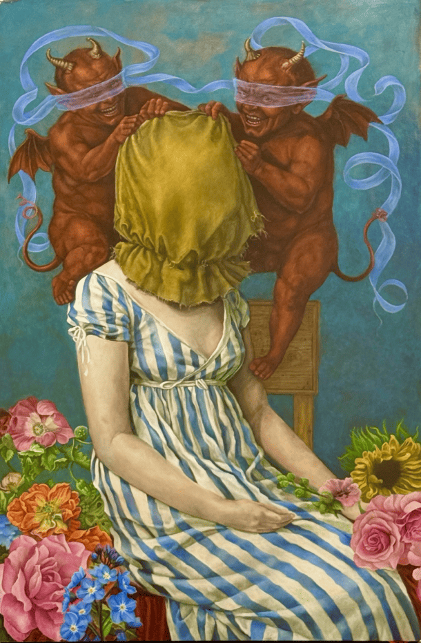
Take RIP ICE, a painting made in response to the shooting of Renee Good. At first glance, it’s full of bright color and flowers, genuinely pretty to look at. Then you notice what’s actually happening: two grinning devils, both blindfolded, pulling a hood over a woman sitting between them. Mason painted the woman’s skin pale and uneven on purpose, so she isn’t tied to any specific race or identity she could be anyone. The blindfolded devils are the key detail: they represent power acting without really seeing who’s in front of it.
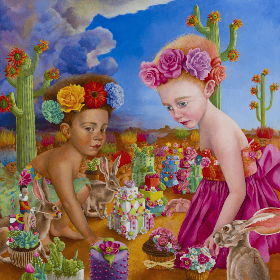
Or look at Esparza, Nadine and the Beautiful Wall, inspired by the wall built along the U.S.-Mexico border. Mason found the whole idea both troubling and kind of ridiculous, especially thinking about how a wall disrupts animals’ natural movement along with people’s. So instead of painting the actual wall, she imagined something a child might build instead: two little girls constructing their own wall made of cakes to keep out trolls, not people. Pinocchio’s tucked into the scene too, a quiet nod to how hard it’s gotten to tell truth from lies these days.
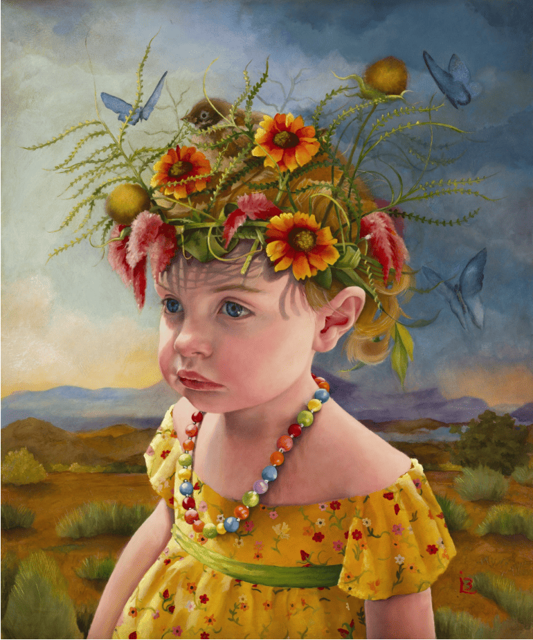
Then there’s Flight, which is a little quieter. A young girl stands by herself in a bare, empty landscape. It’s Mason’s way of asking a simple but heavy question: what kind of planet are we actually leaving behind for kids like her?
Why the Contrast Matters
None of these paintings shout at you. They’re gorgeous first, unsettling second, and that order is intentional. Mason wants you to fall for the painting visually before you clock what it’s actually about, because that gap between beauty and discomfort is exactly where the meaning lives.
It’s a rare combination: a genuinely difficult subject, handled with a technique built for patience and glow rather than speed. If you find yourself standing in front of one of Lib Mason’s paintings a little longer than you expected to, that’s more or less the point.
Browse Lib Mason’s complete portfolio at libmasonartist.com. To follow along as she builds her paintings layer by layer, connect with her on Instagram@libmason5687.
